
UX/UI CASE STUDY
ComfortableCook
Modern e -commerce redesign focused on simplicity, user flow and conversion.
Role: UX/UI DESIGN
Duration: 6 months
Team: Justyna ,Kamil ,Anna
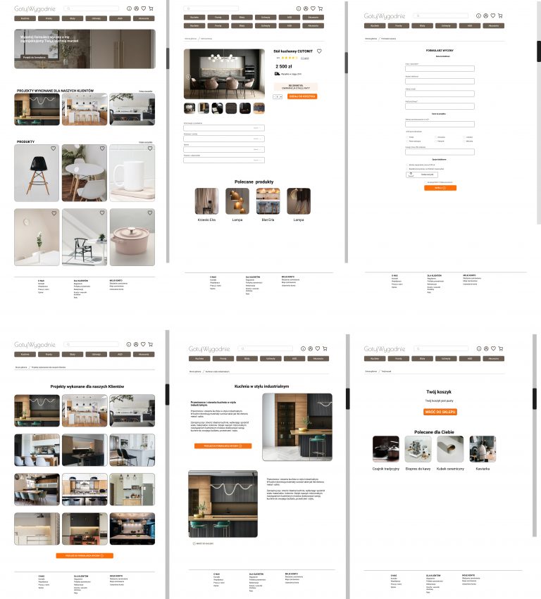
Client
A kitchen furniture manufacturer – Gotuj.Wygodnie.pl- a polish kitchen furniture brand focused on custom – build solutions.
The client needed a modern website with an intuitive order form to simplify complex customer requests and improve sales communication.
Competition: Campaigns with similar business profile.
The Goal
To create a desktop – optimised , responsive platform where users could:
-Easily fill out a detailed kitchen order form
-Request build in appliances
-Get a custom quote without needing a separate architect
-Experience a seamless, professional service from the first click.
The Solution
We designed a streamlined online ordering tool integrated into a responsive website.
The form focused on:
-Clear , simple questions
-Smart logic
-Customer quote generations
-Build in product selection options sections base on user.
This solution made it easy for both everyday users and premium clients to place detailed, personalised kitchen orders- without confusion or delays.
DESIGN PROCESS
About the project
Title:”Furniture company form redesign”
Problem:
– the current form is too long and confusing
– it causes customers
drop-offs
-the company wants a simpler, more user- friendly solution
Persona
“Who are we designing for”?Name: Adam 30-40
Background: office manager
Place of living: city up to
150,000 residents
Goals: quick purchase ,
less friction
Pain points: too many steps, unclear language
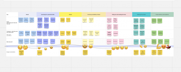
Research & Insights
“Understand the problem”
-customer journey
-user stories
-proto persona
-empathy map
-the value proposition canvas
Design
“Design improvements “
We broke the original long form into manageable, multi-step sections to reduce user overwhelm and increase completion rates
-progress bar, group fields, contact info, preferences, delivery.
Customer journey
To improve user experience of the furniture company’s long and confusing form , we are restructured it into a clear , multi – step layout.
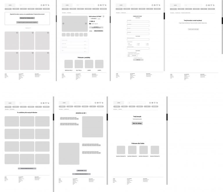
Wireframes / Low- fidelity
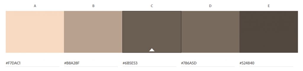
Colour palette
Logo ideas
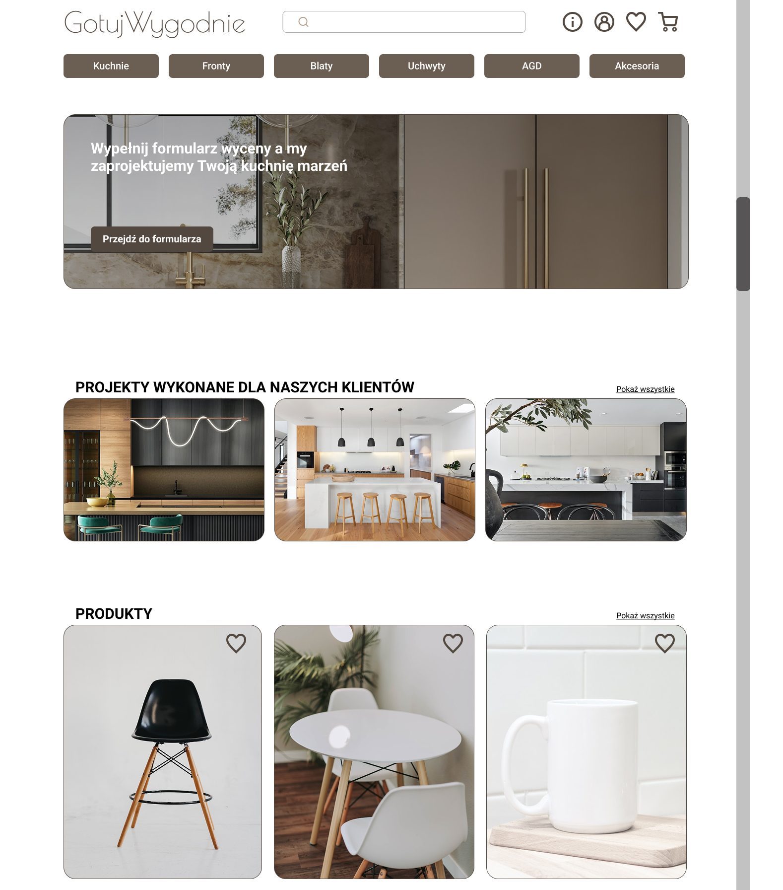
High Fidelity
Impact & Value Delivered
✏️Increased sales conversion
✏️Improved customer communication
✏️Stronger brand image
✏️Easier internal processing for the sales team
✏️Better reviews on overall customer experience
Case Study
Finance App
Modern finance tracking app design to help young people take control of their money with confidence.
It empowers users to build healthy financial habits, track spending mange savings, and pay off debt- all in one in simple intuitive platform.
About the Project
“Helping the next generation take control of their money with confidence “
Modern finance tracking app design to help young people take control of their money with confidence. It empowers users to build healthy financial habits, track spending mange savings, and pay off debt – all in one in simple intuitive platform.
Purpose
Many young adults struggle with money management due to lack of financial education and overwhelming debt.This app provides the tools they need to: – track daily and monthly expenses , – monitor and reduce debt step by step , – get personalised financial tips and remainders.
Target Audience
Students and recent graduates,
Young professionals
Creators and freelances
Users who are feeling overwhelmed by finances.
Finance App , Me & Money
Design Thinking Process
Empathize
Goal :Understand my users – their needs, fears and habits with money.
Define
Goal : Formulate a clear problem statement based on findings.
Point- of – view statement.
“Young professionals need a simple and encouraging way to manage debt and budgeting because they feel overwhelmed, ashamed and lack financial education”
Ideate
Goal:Generate creative solutions and features.
Methods:Crazy 8s sketching
Brainstorming
MoSCoW prioritisation (Must – have, Should- have )
Prototype
Goal:Create low to high – fidelity prototypes.
Tools:Miro ,Figma.
Pages to prototype:
-Welcome
-Dashboard with insights
-Budgeting tab
-Debt payoff tracker
-Progress reward/ badges
Test
Goal:Get feedback and improve the design.
Activities:
-Usability test (5 users min)
-Clickable Figma prototype testing
-A/B testing different features
Iterate
Apply feedback and repeat cycle
Make changes based on real user insights
Improve flows, wording, visuals
Add or remove features to improve clarity and usability
About Persona
Persona
Name : Emma
Age: 24
Location: Manchester , UK
Occupation : Junior Marketing
Education: University graduate
Income: £24,000/year
Living situation : Rents with one roommate
GOALS:
-Get out of credit card debt (about £2,000)
-Save for a solo holiday
-Stop impulsive spending
-Understand budgeting better
-Feel confident about her money choices
Pain points
-Overwhelmed by monthly expenses and debt
-Doesn’t know where her money goes
-Finds most finance app too boring, too complex, or too judgmental
-Feels shame when looking at her bank balance
-Can’t build consistent financial habits
CURRENT TOOLS:
-Uses Monzo for spending
-Notes app for budgeting
-Instagram/TikTok for finance tips
-Occasionally opens savings account , then forgets about it
Needs
-A friendly , clear visual of her finances
-A non-judgemental app that makes money feel. doable
-Motivation to keep improving (gamifications , daily wins)
-A trackerthat makes progress feel rewarding
-Smart insights without overwhelming graphs
PERSONALITY
-Creative, slights anxious, motivated but needs nudging
Feels like money isn’t her “thing” but wants to be better
-Likes apps that feel playful and simple (e.g Duolingo, Headspace)